

The Reframe
The assignment
They handed me a content problem: make better videos, write clearer materials.
The real problem
It was an experience problem.
Cerner Learning is a clinical training platform, and its job is narrow and high-stakes. When a hospital switches to a new electronic health record, thousands of clinicians have to learn new workflows while they are still seeing patients. Not “learners” in the abstract. A hospitalist, an ED nurse, an acute care nurse, a cardiologist. Different roles, different days, and not one of them with a spare hour. They learn the new system in the gaps between patients.
The content itself was fine. What was missing was a path: where am I, what is next, why does this matter for my job, and can I do it in the 3 minutes I have. Once I saw it that way, everything downstream changed.
I was the sole UX designer, from the first sketch through launch. Internally we called the project Learning Journey; it shipped as Cerner Learning and runs as Oracle Health today. It carries 2 very different muscles: a learner side that has to feel consumer-grade, and an admin side that has to hold up as enterprise infrastructure. This is the story of both.
Discovery
The reframe came from talking to clinicians in the middle of their shifts.
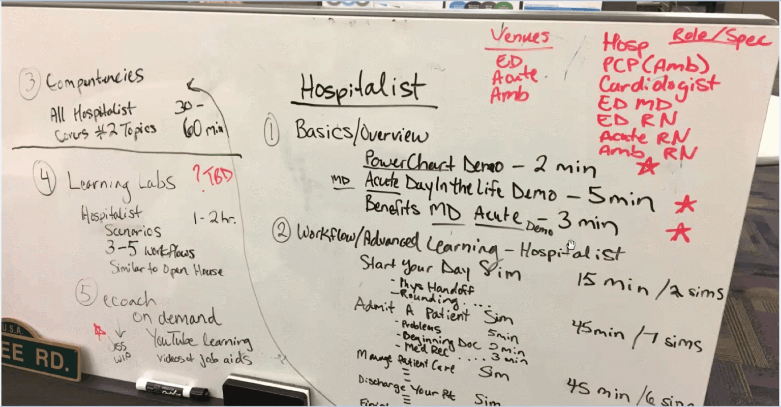
I do not over-research. I research just enough to ask better questions. So we mapped it on the wall: every role, every venue, what each person had to be able to do before go-live, and how long it actually took. Hospitalist basics, then workflow, then the simulations. 2 minutes for this one, 5 for that one.
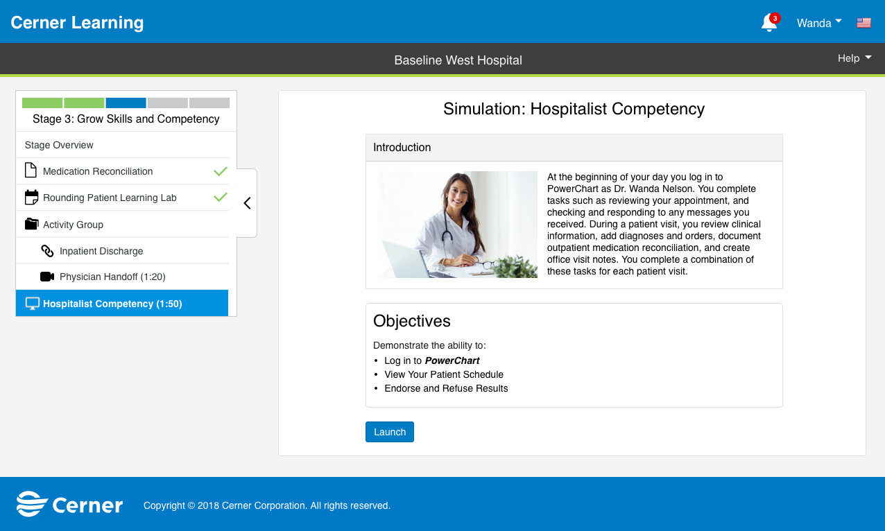
What surfaced was the shape of the thing. The learning had to be role-based, task-specific, and short. Not a course anyone sits through. A rehearsal for a real shift.
Vision: Progress-First & Responsive
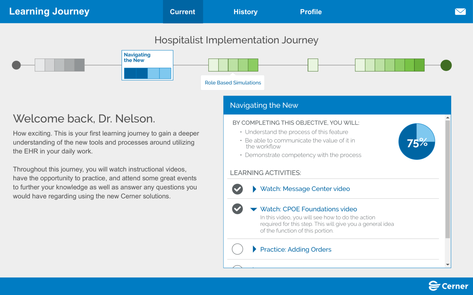
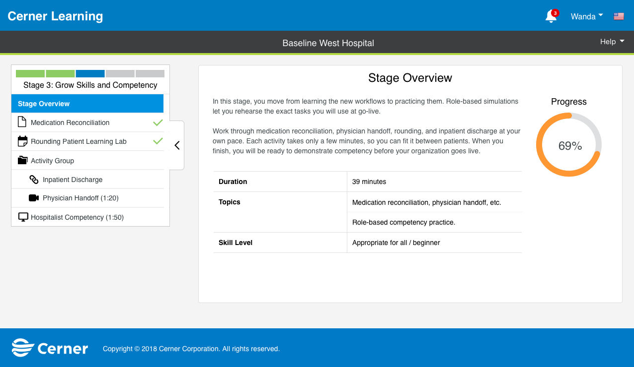
The first design move came straight out of the reframe: take a pile of content and turn it into a journey. Stages you move through, progress you can see.
When someone can see where they are and what is left, a mountain of training becomes a path they can walk.
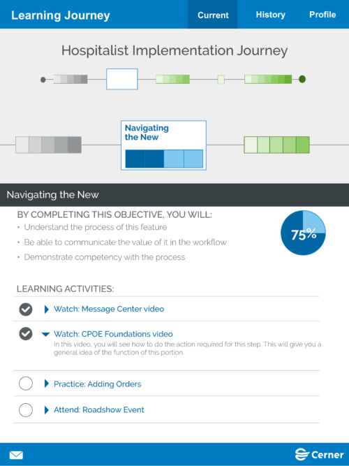
That progress-first model became the spine of the entire product. It also had to meet clinicians where they actually are: desktop at the workstation, tablet on the floor, phone in a pocket. Learning happens in the flow of work, on whatever screen is in hand. Testing was clear that the phone mattered more than the tablet, so that is the reality we optimized for.
The Learner Side
Consumer-Grade Craft
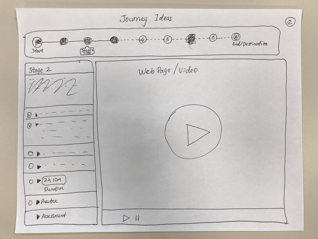
This is the craft-and-empathy half, designed for the 30 seconds a clinician has between patients. It started on paper: journey ideas, a stage summary, a completion screen. The sketch is where the structure got decided: the journey, the stages inside it, and the sense of arriving somewhere at the end.
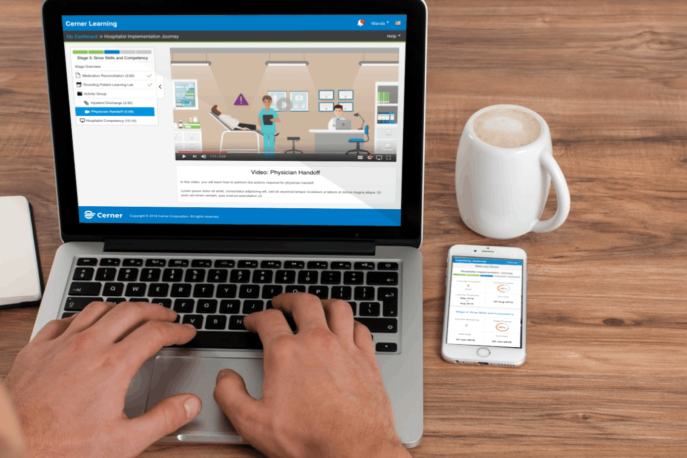
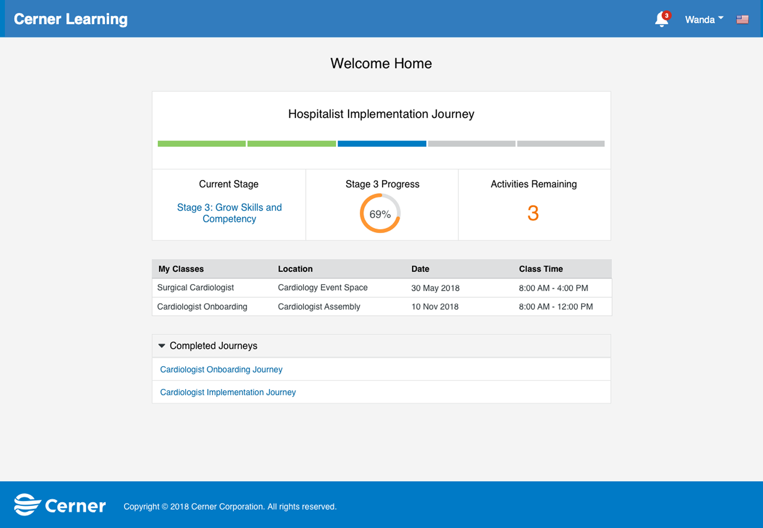
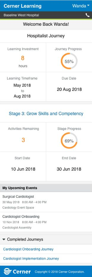
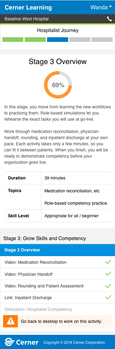
“Welcome back, Dr. Nelson.” 1 glance tells you 3 things: where you are, what is next, and how much is left. We took the invisible question, how much of this do I still have to do, and put it on the surface. For someone squeezing this in between patients, that clarity is the entire point.
Where it all comes to rest
The phone mattered most.
Same journey, same stages, same progress, now in a pocket, on the floor, between patients. Some activities send you back to a desktop, and the interface is honest about that. But the day-to-day checking in and tracking lives here: learning that fits the 30 seconds a clinician actually has.
The Admin Side
Systems Thinking
If the learner side is craft and empathy, this side is the enterprise infrastructure that made the product scale.
Every journey a learner walks, someone has to build. A single hospital runs dozens at once, 1 per role, cloned from master templates and turned on or off as rollouts change. So the first job was to make building a journey feel manageable.
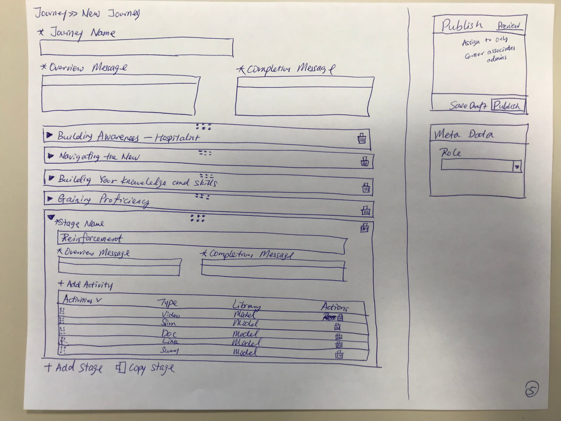
Like the learner side, it started on paper. A journey has a name, stages, and activities inside each stage: a video, a simulation, a job aid, a survey. The builder is the mirror image of the journey a learner walks. The learner experiences stages moving forward; the admin assembles those same stages in reverse. 1 structure, 2 audiences, 2 very different jobs.
The Hardest Problem: Versioning
Changing a journey already in motion
The hardest problem was not building a journey. It was changing one that was already live.
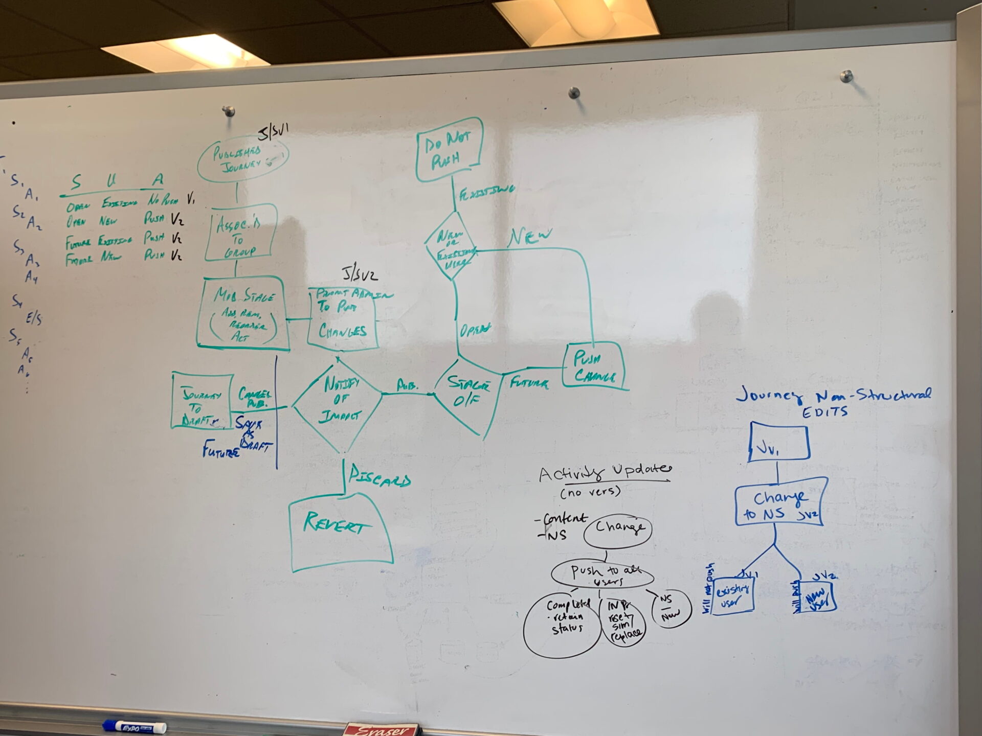
Real people are partway through it. Some finished stage 2. Some are midway through stage 3. You cannot overwrite the thing underneath them. The question was never how to save an edit. It was how to change a live journey without breaking the people inside it.
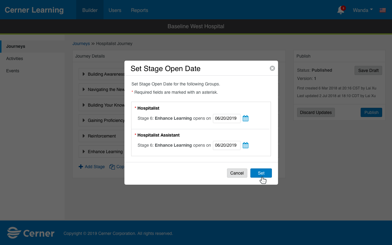
Schedule the change
Choose when the new stage opens and for which group. Nothing goes live the instant it is saved.
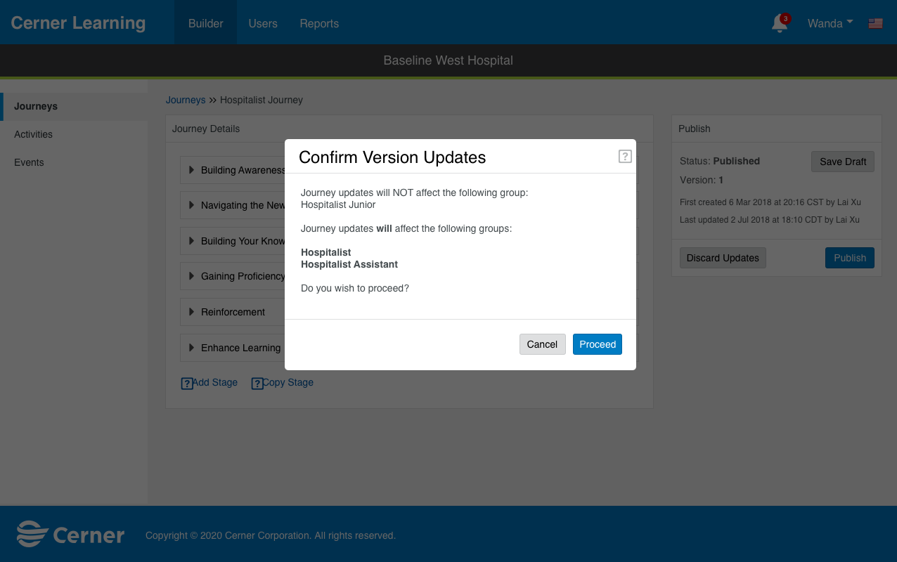
Review the impact
The system identifies exactly which groups will be affected, then stops for a person to confirm.
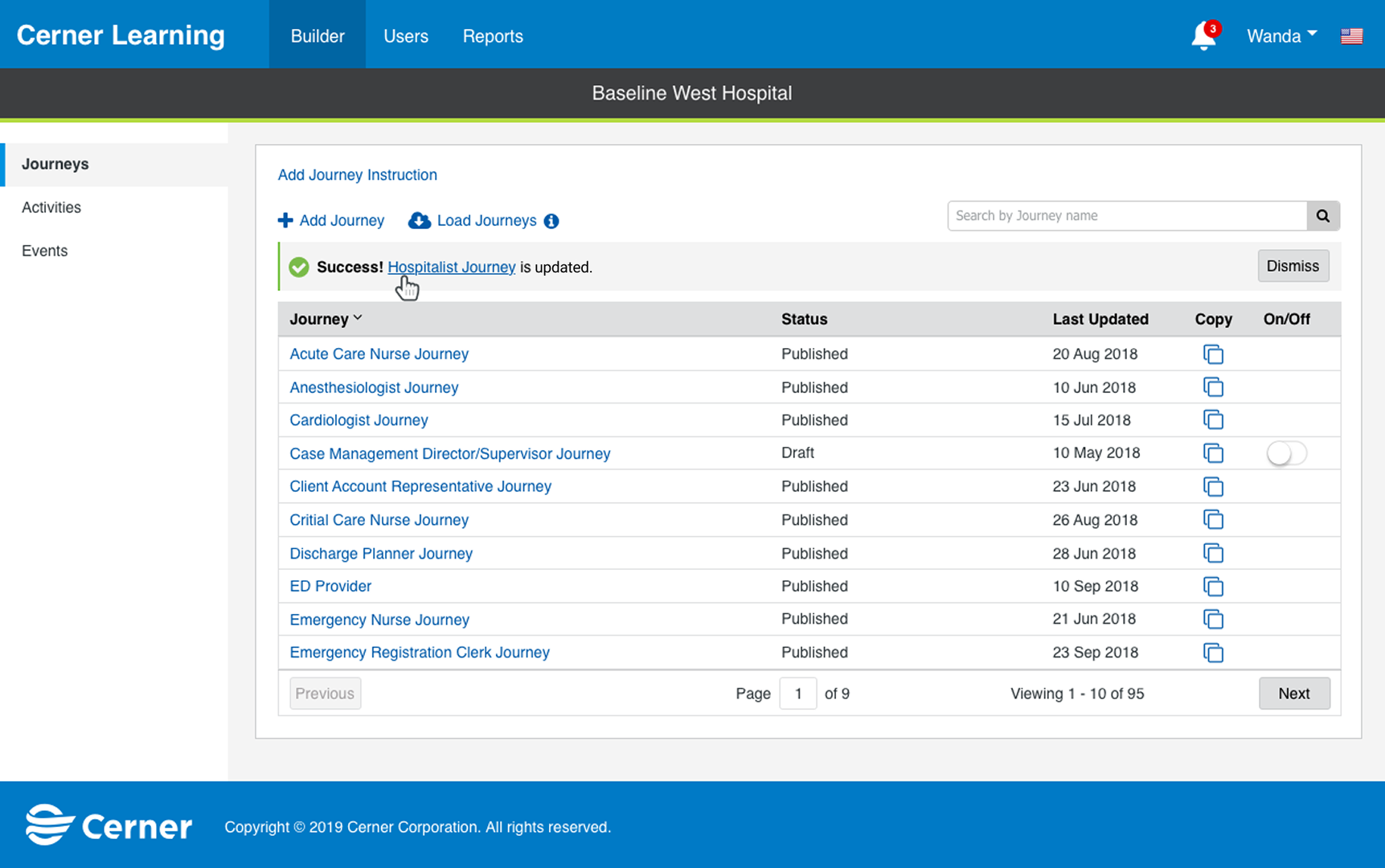
Land it safely
A stage is added to a live product. Hundreds of learners continue without disruption.
Users, Groups & What Testing Changed
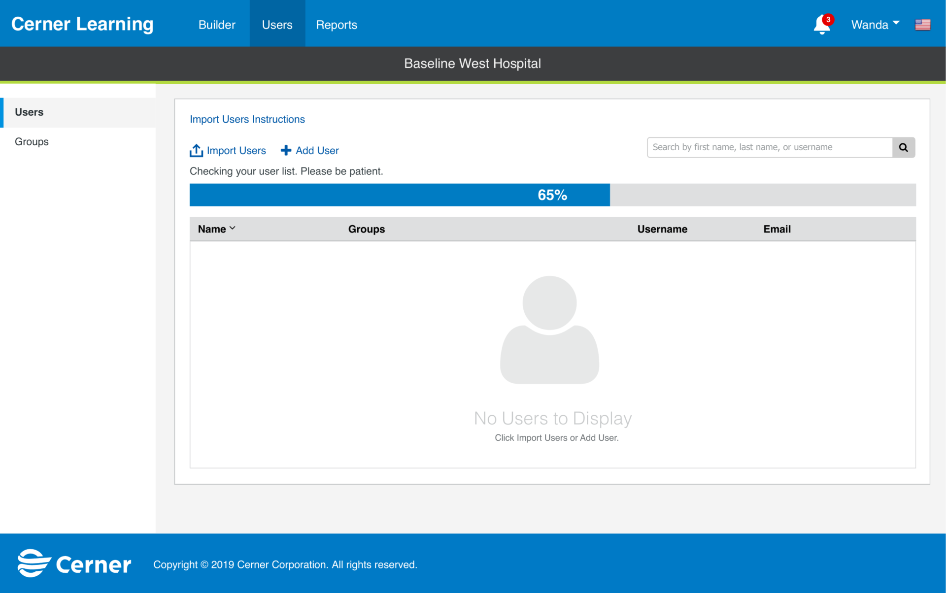
Before a hospital can assign anything, it has to get hundreds or thousands of clinicians into the system. So this begins with a bulk import. Nobody hand-enters a hospital.
Then journeys and people get connected through groups. My original design for creating a group was 1 long screen: name it, add members, assign journeys, all at once. It made sense on paper. Then we tested it, and testing told me I was wrong. 1 screen doing 4 jobs overwhelmed people.
So I broke it into a wizard: 3 clear steps.
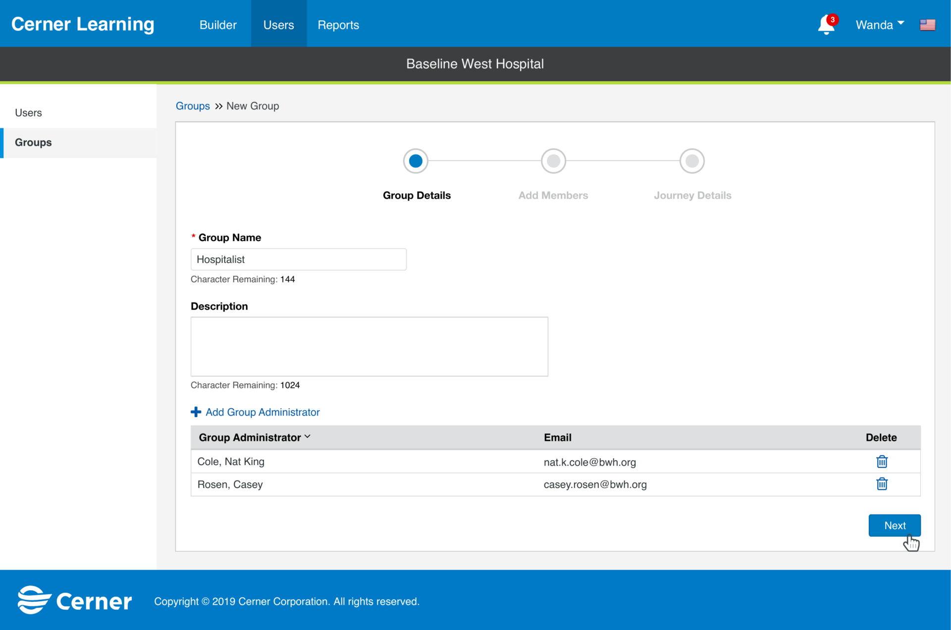
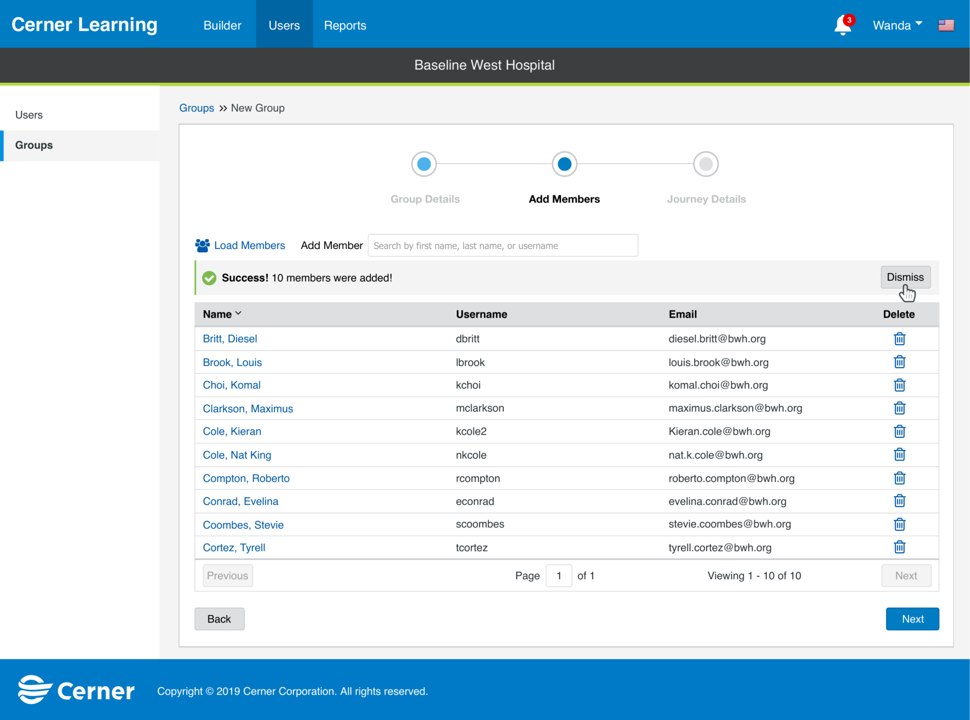
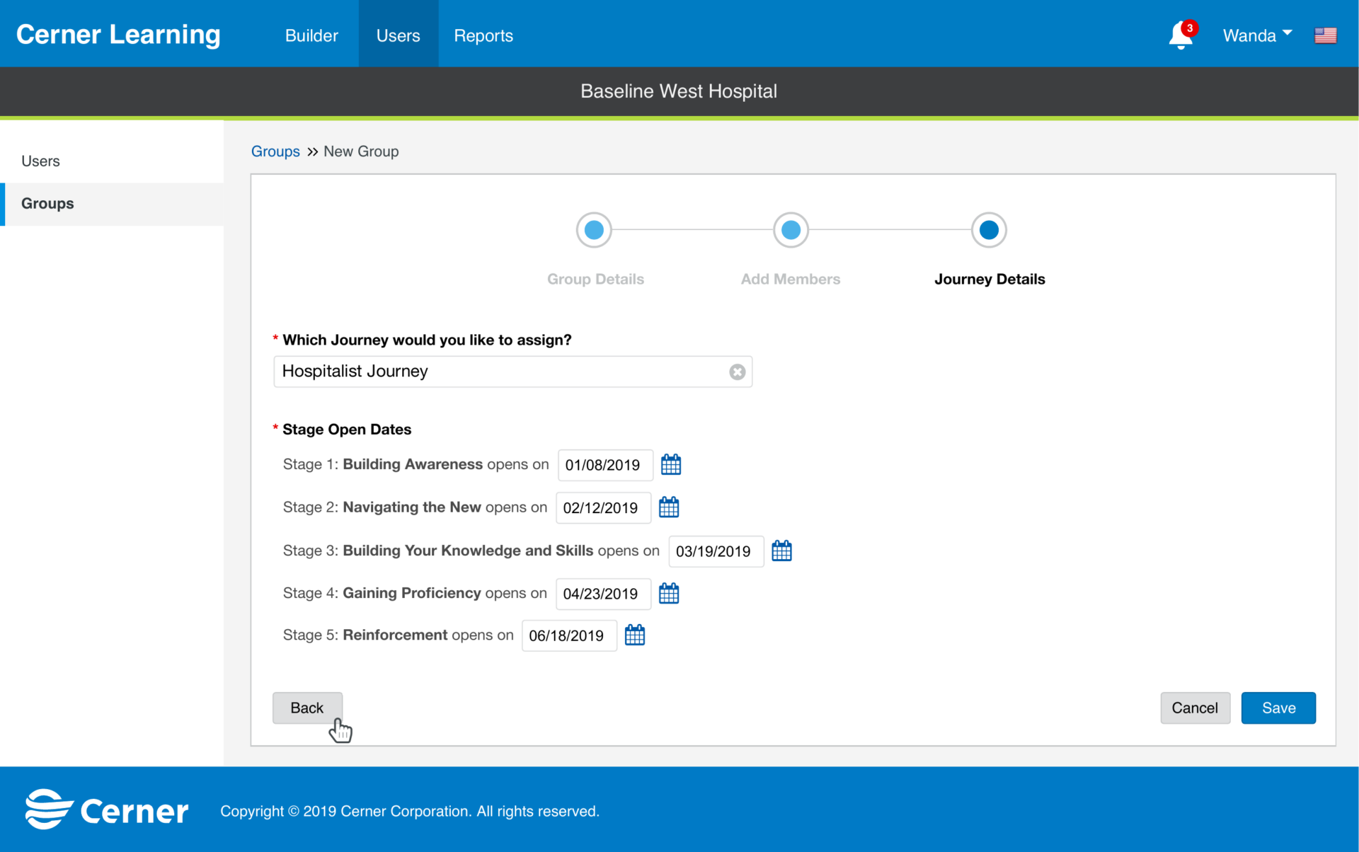
That is the honest version of this story. The structure did not come from my first instinct. It came from watching people struggle and changing it. This is what usability testing is actually for: not validating what you built, but finding where it breaks. Accessibility was treated the same way, as part of the definition of done rather than a pass at the end.
The third step is the payoff of the whole admin side. You assign a journey to the group, then set when each stage opens, paced across the rollout. This is how a hospital controls go-live: the right stage, to the right group, at the right time.
Readiness, Not Completion
Reporting
The last question on the admin side is the one that matters most. We built it, assigned it, scheduled it. Is it working?
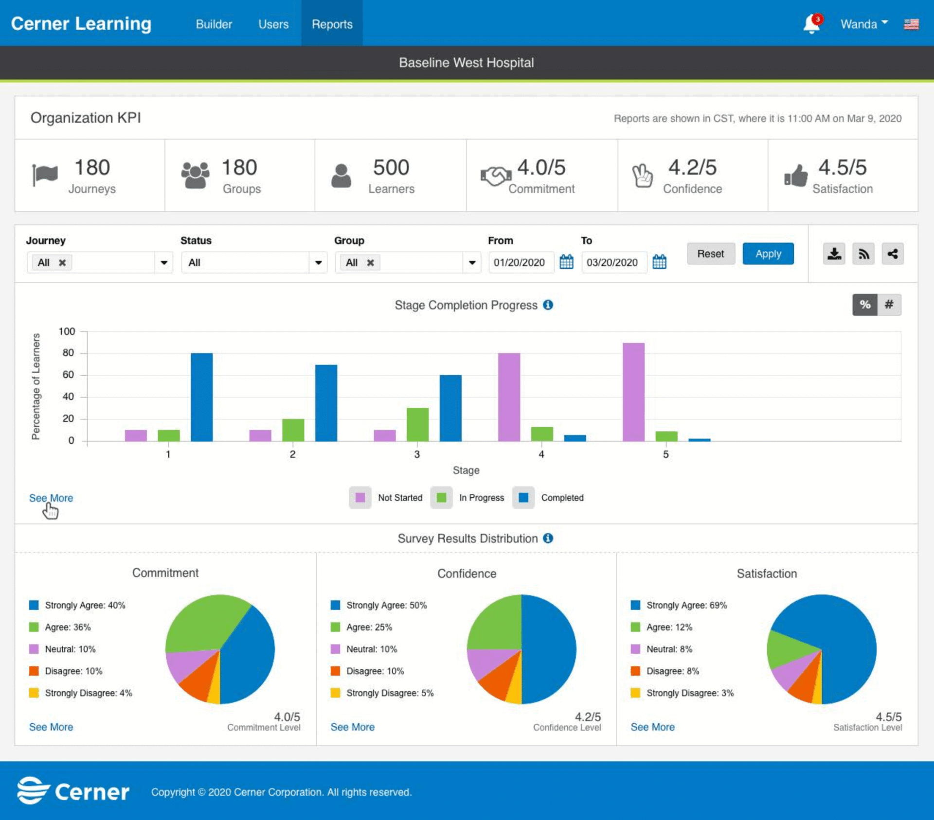
Reporting started as a sketch: completion by stage, survey results, the top groups. But the question behind it was never “did they click through.” It was “are they ready.”
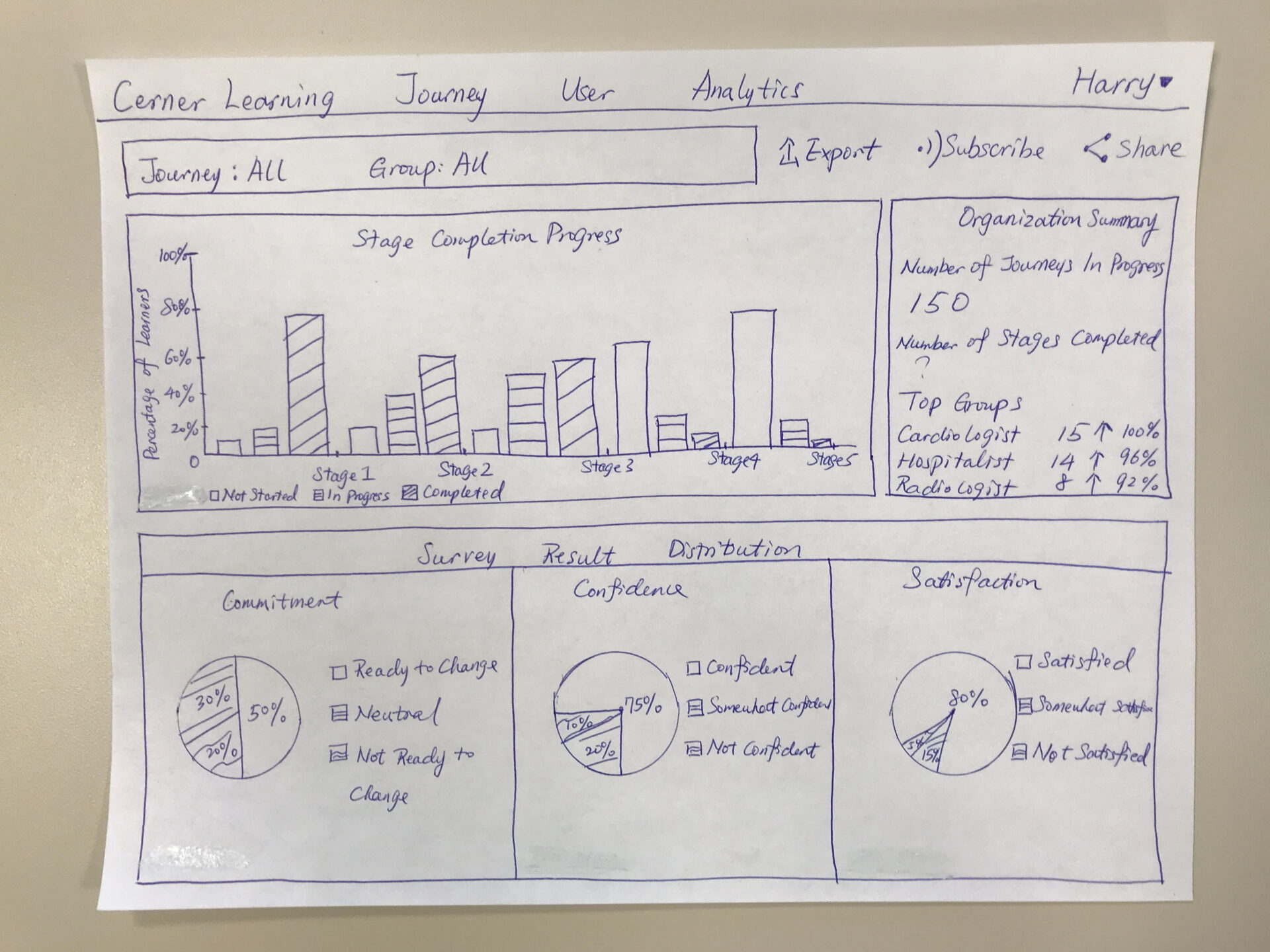
The framing decision
Completion is not the goal. A clinician being ready for go-live is.
The dashboard does not lead with how many videos were watched. It leads with commitment, confidence, and readiness. The sample data shown here represents 500 learners inside a single client system.
Scale & Durability
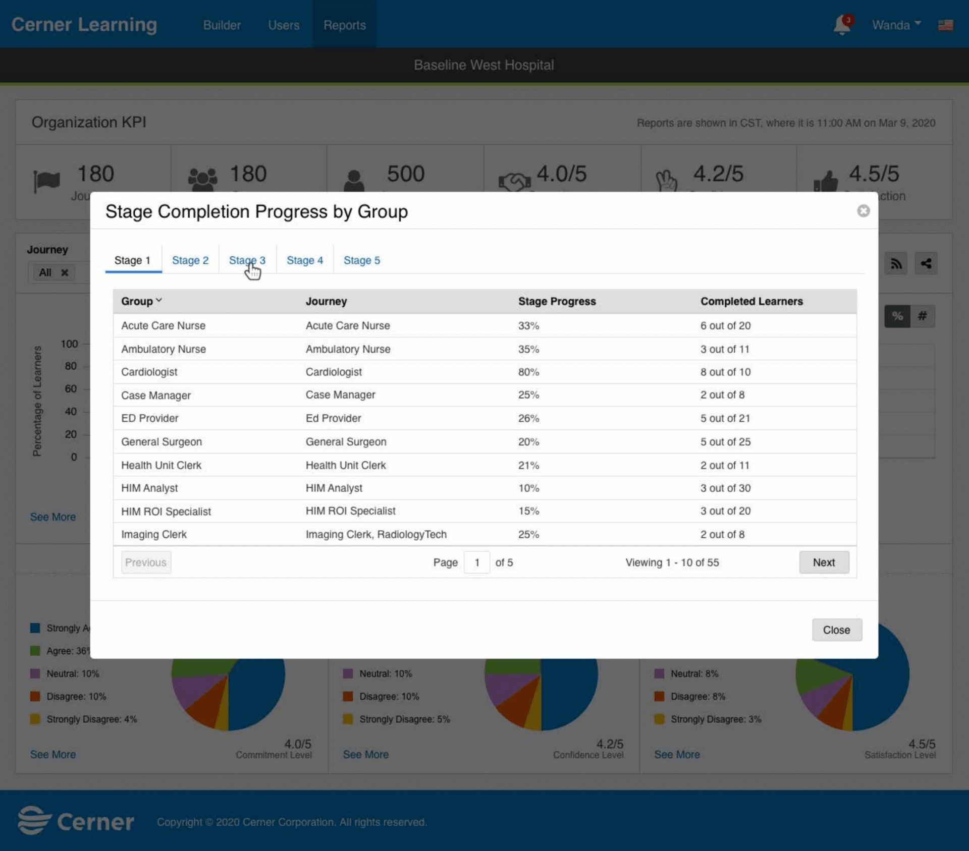
The same journey runs across every device, the vision whole. Clients roll off as they finish their EHR adoption, which is the product doing its job and letting go. The reach was real, and it was global.
A foundation that lasted
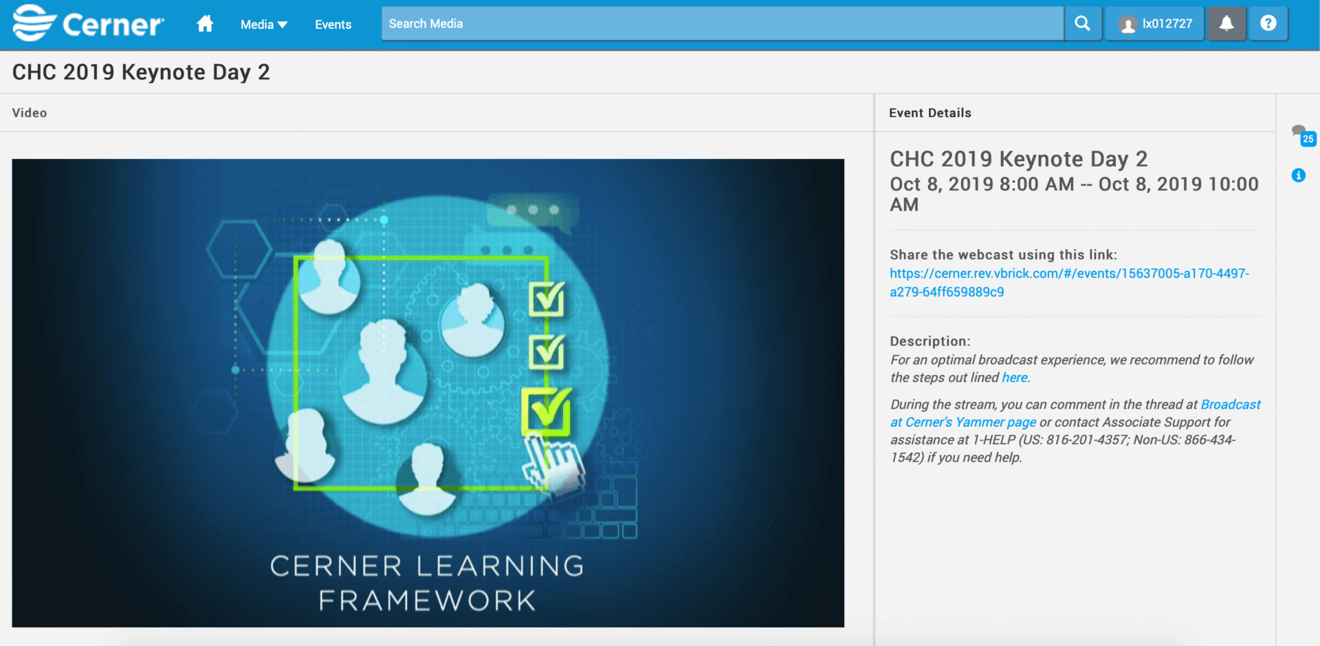
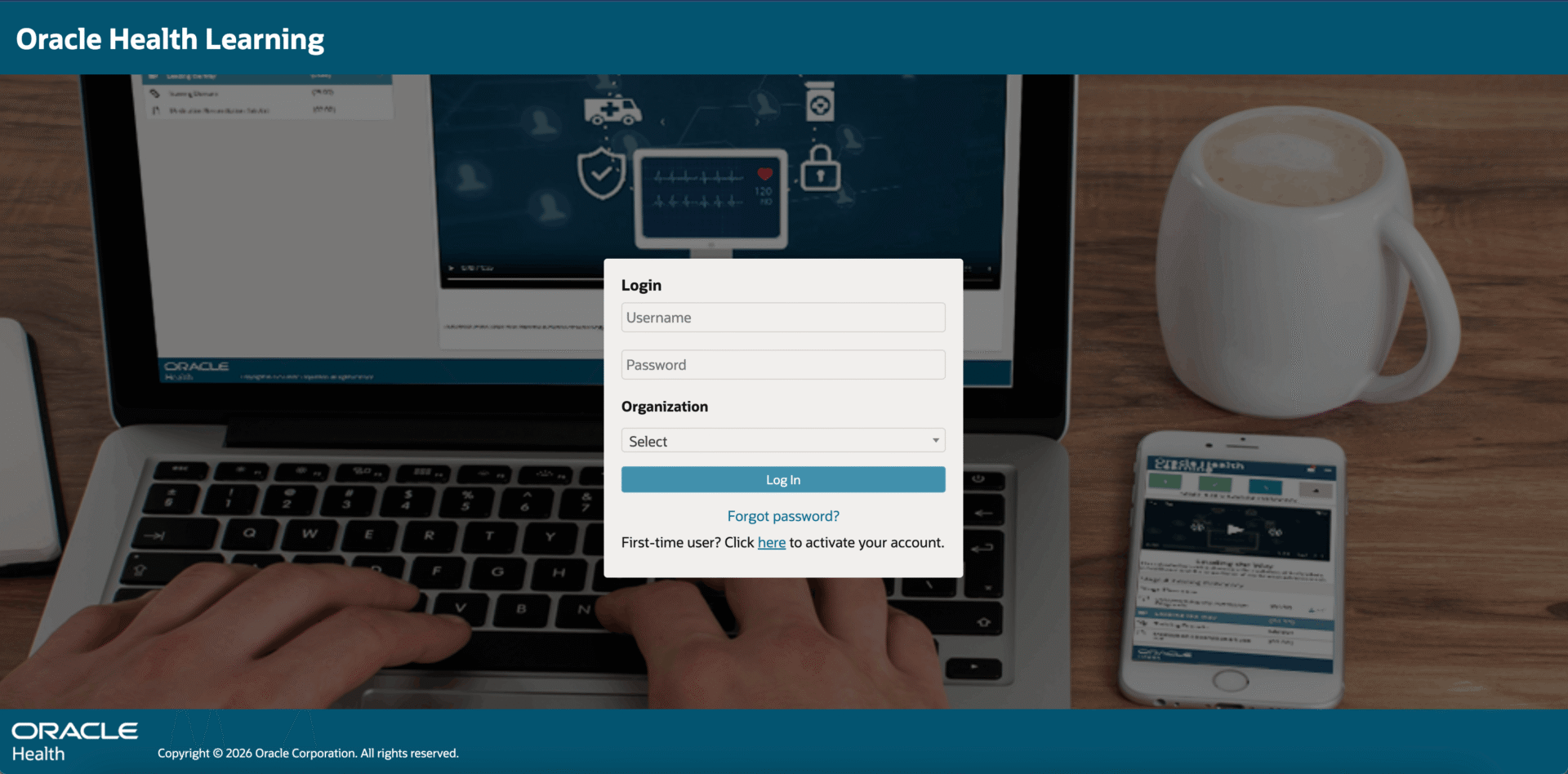
9 years after the first sketch, the platform is still in production. The logo changed; the experience did not. No UX redesign, in all that time.
What matters most
Not what launches. What is still standing years after you have moved on.
From the product owner
“The fact that Learning Journey is still going strong after all these years, without a dedicated UX associate, is a testament to the foundation Lai laid out for us.” — Mike Michalski