1. The Product & The People
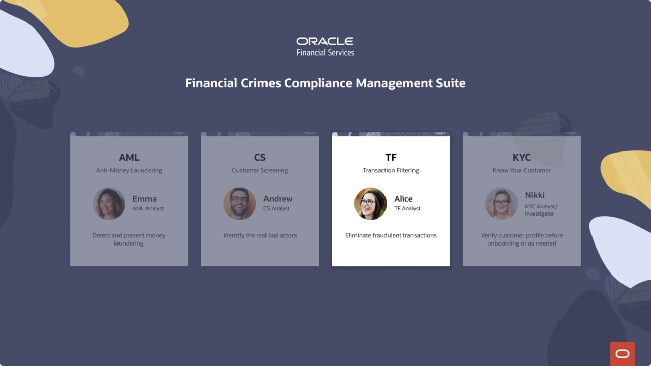
Transaction Filtering is one of four products inside Oracle’s Financial Crimes Compliance Management suite, a system built to protect banks from some of the highest-stakes risks in financial services. While AML watches for suspicious patterns, Customer Screening flags bad actors, and KYC verifies who customers really are, Transaction Filtering does something more immediate: it catches fraudulent transactions before they clear.
Every transaction a bank processes is screened against global watchlists in real time. When a match is flagged, it lands in an analyst’s queue, and the clock starts. Analysts have SLA windows to review each alert, compare the transaction details against watchlist records, and make a judgment call: block it, release it, or escalate it to a supervisor. Miss the window, and the bank’s compliance standing is at risk.
In 2024, I led the end-to-end redesign of Transaction Filtering, owning the experience from discovery through usability testing. What made this project different from the start was who I was doing it with. I had helped hire Mehul, a new Principal UX Designer joining our team, and when I was resourced to this project, he was just finding his footing. We built this together — I set the project structure, ran the timeline, and led design decisions; he embedded in the Financial Industries team, absorbed the domain, and became a real thought partner.
The product we inherited existed. But it hadn’t been designed so much as accumulated: screens that answered functional requirements without ever asking how an analyst actually thinks, moves, or gets through a queue of 100 alerts before end of day.
That was the real starting point.
2. Understanding the Users
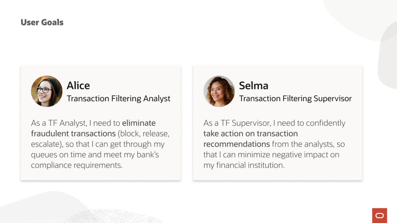
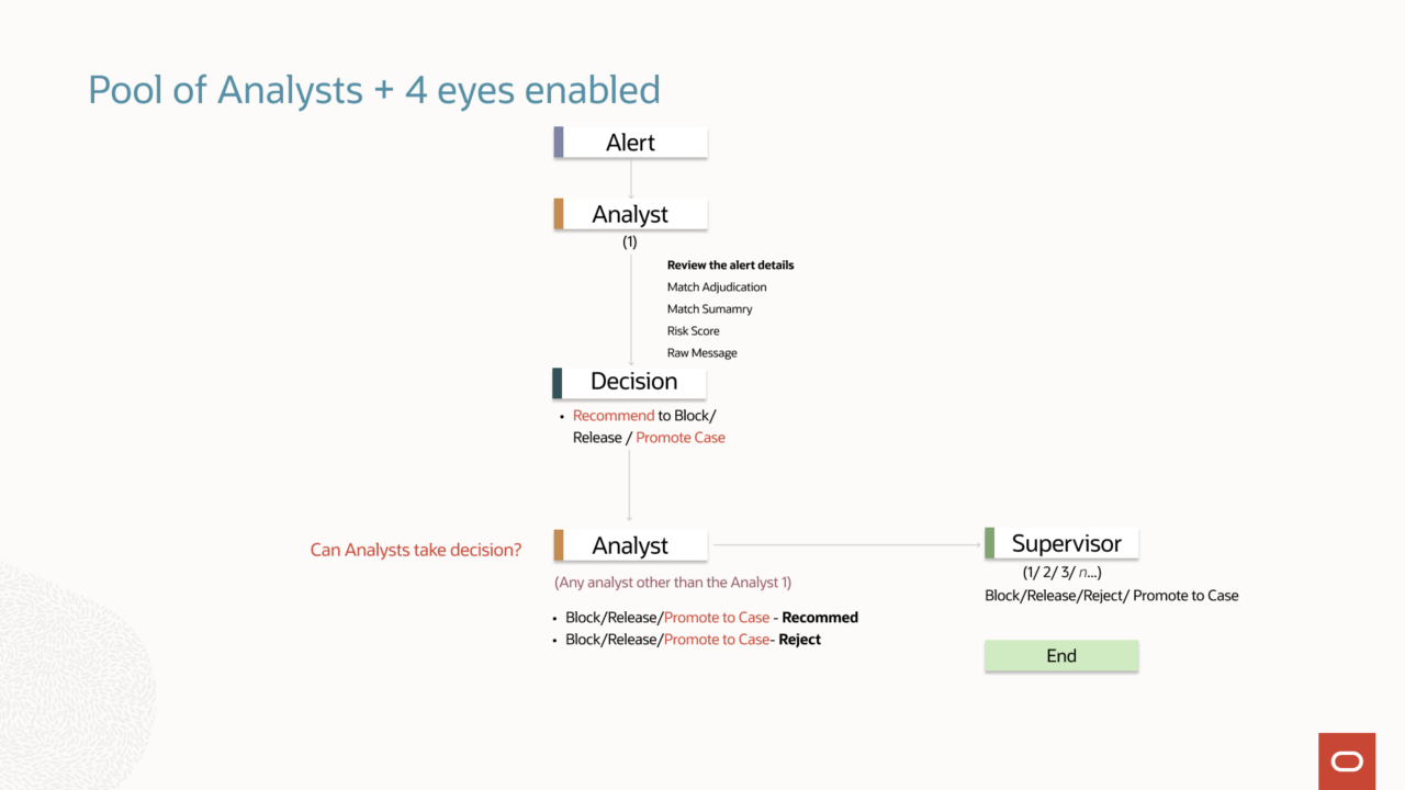
Transaction Filtering is built around a 4-eye principle: every flagged transaction requires two independent reviews before a final decision is made. Alice, the analyst, goes first: working through her queue, evaluating each alert, and making a recommendation. Selma, the supervisor, goes second: reviewing Alice’s work and making the call that actually determines whether a transaction is blocked or released.
Neither role is a rubber stamp. Both carry real compliance accountability. The design has to serve both.
3. The Problem
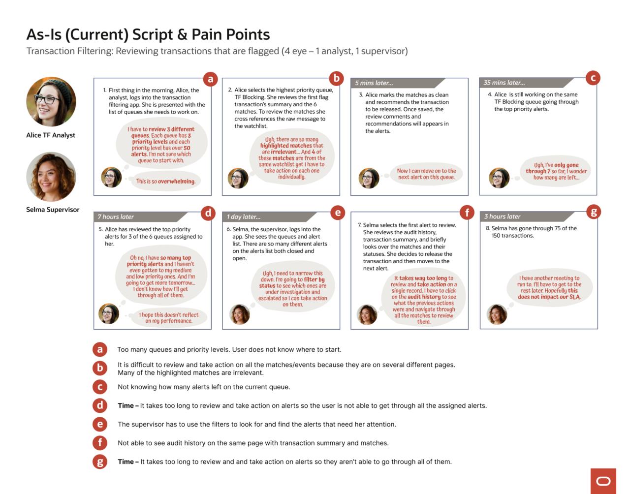
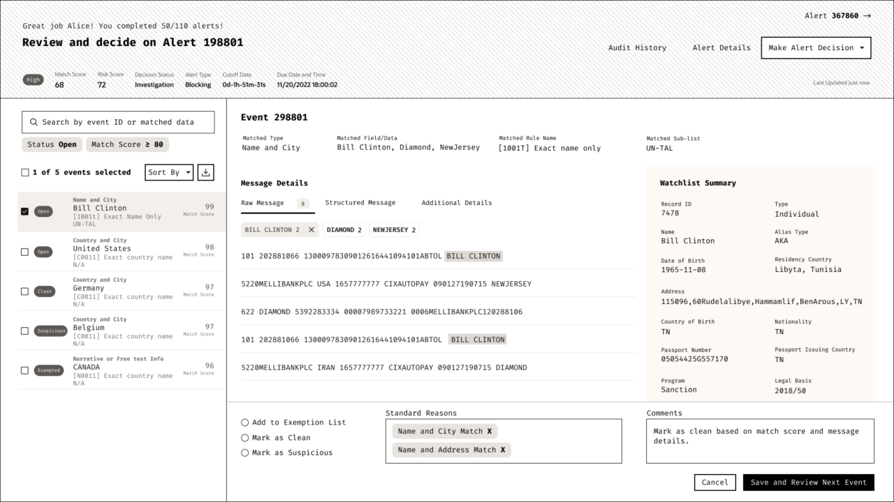
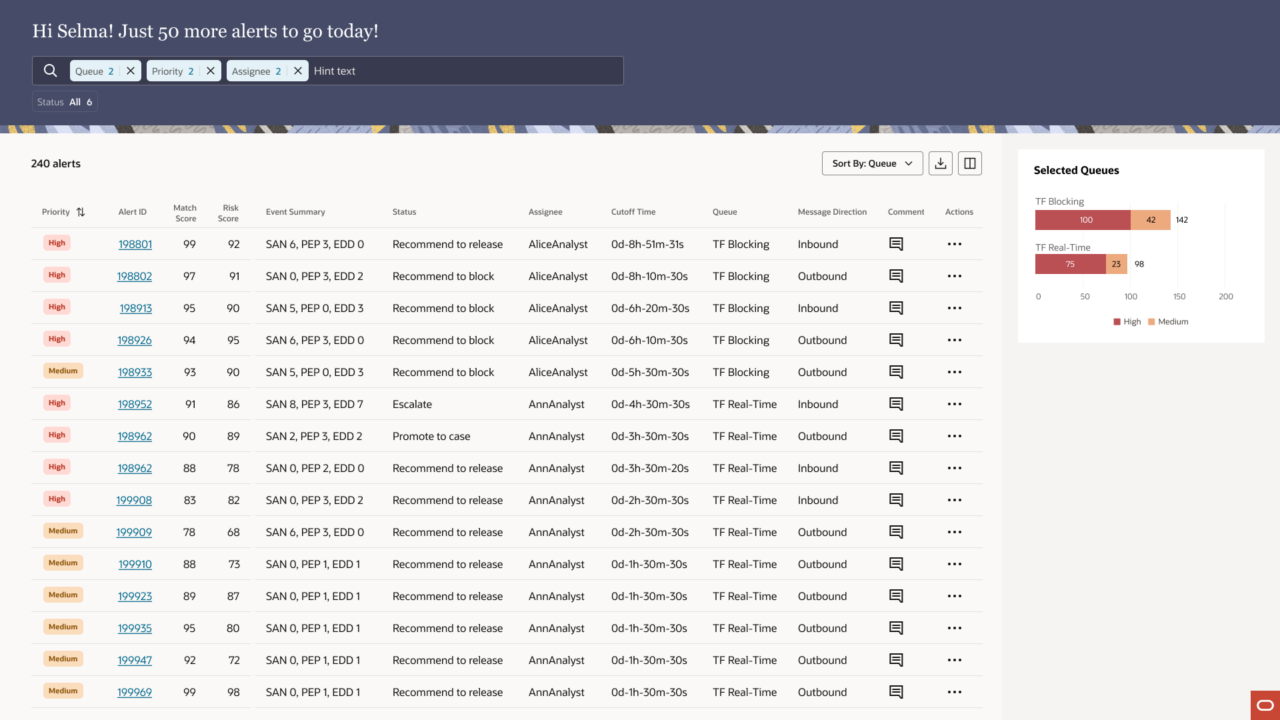
The legacy product put everything on one long, unstructured page. Alice had to cross-reference transaction data against watchlist details across multiple screens, judge each of five to nine events individually, then scroll back down to submit a case-level decision, all against a ticking SLA. On a typical day, that’s 100 alerts. The cognitive load was relentless.
Selma’s experience was no better. She had to filter her own queue to find what needed her attention, navigate away from the list to review individual records, and piece together audit history from separate pages. By the time she had enough context to decide, she’d already spent more time than the workflow should have required.
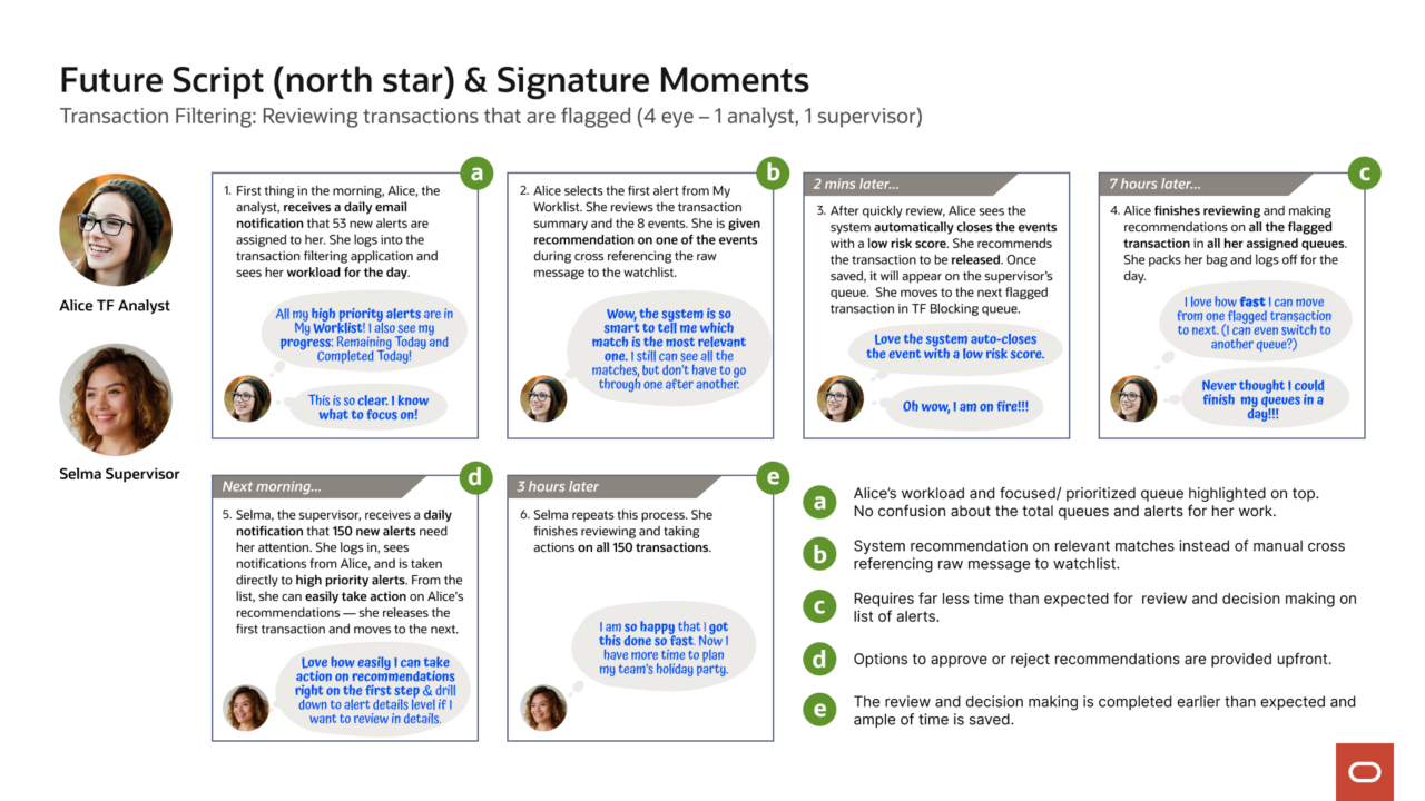
The storyboard below maps the full journey: where time was lost, where context was missing, and where both users were left without the clarity the work demanded.
4. Discovery
Before designing anything, I needed to understand the shape of the problem, not just what users were doing, but the scale and texture of the data they were working with every day.
I came in mid-project, which meant running my own discovery. I started with interviews: stakeholders, financial services consultants, domain experts; working through user background, goals, workflow, and pain points before ever asking a numbers question. Shape of Data questions come after you understand the person. Only then do the numbers mean something.
The questions I asked were deliberate: how many transactions does a bank process per day? How many get flagged? How long does an analyst spend on each alert? How many matches can a single flagged transaction carry? The answers varied significantly by client size: a small bank might process 10,000 transactions a day; a large one, 300,000 to 500,000. But what stayed consistent was the ratio that mattered most: roughly 90% of flagged transactions are false positives. Analysts aren’t investigating threats. They’re triaging noise: at volume, under SLA pressure, every single day.
That reframed everything. The design couldn’t ask Alice to slow down and investigate each alert deeply. It had to support fast, confident pattern recognition, helping her move through her queue, not pull her out of it. And with a single flagged transaction potentially carrying 5 to 10 matches, the interaction model had to let her compare events against the watchlist and make a case-level decision without ever navigating away from the page.
The data didn’t just inform the design. It defined the constraints.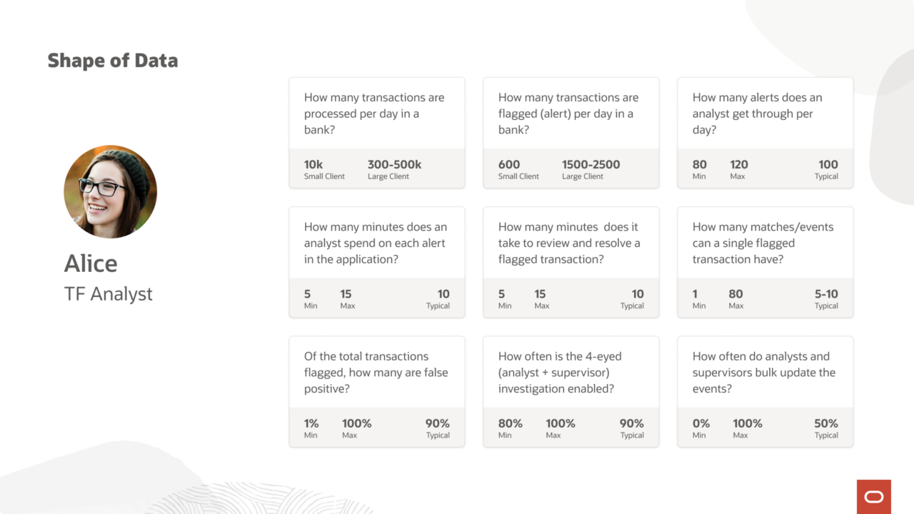
5. Design Exploration
The Future Script gave us the north star: Alice logs in, sees her prioritized workload immediately, moves through alerts with confidence, and finishes her queue in a day. Selma receives Alice’s recommendations, takes action from the list without drilling in, and closes out 150 alerts in three hours. Both users leave on time.
Getting there required finding the right structure first, and that took longer than expected.
The first attempt followed what UX leadership recommended: a data management page with a table of events, and a drawer that opened over the page when Alice clicked in to act on one. It was logical on paper. In practice, the drawer cut Alice off from the context she needed, she couldn’t see the case while making an event-level decision. Every action required mentally holding information from a page she could no longer see. 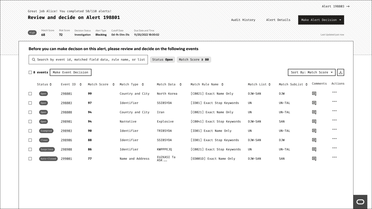
The second attempt was a dashboard layout, originally designed around Selma’s view of the queue. But Selma’s experience isn’t a fundamentally different flow from Alice’s. It’s the same flow, already filtered. A dashboard skin didn’t solve the underlying problem for either of them. 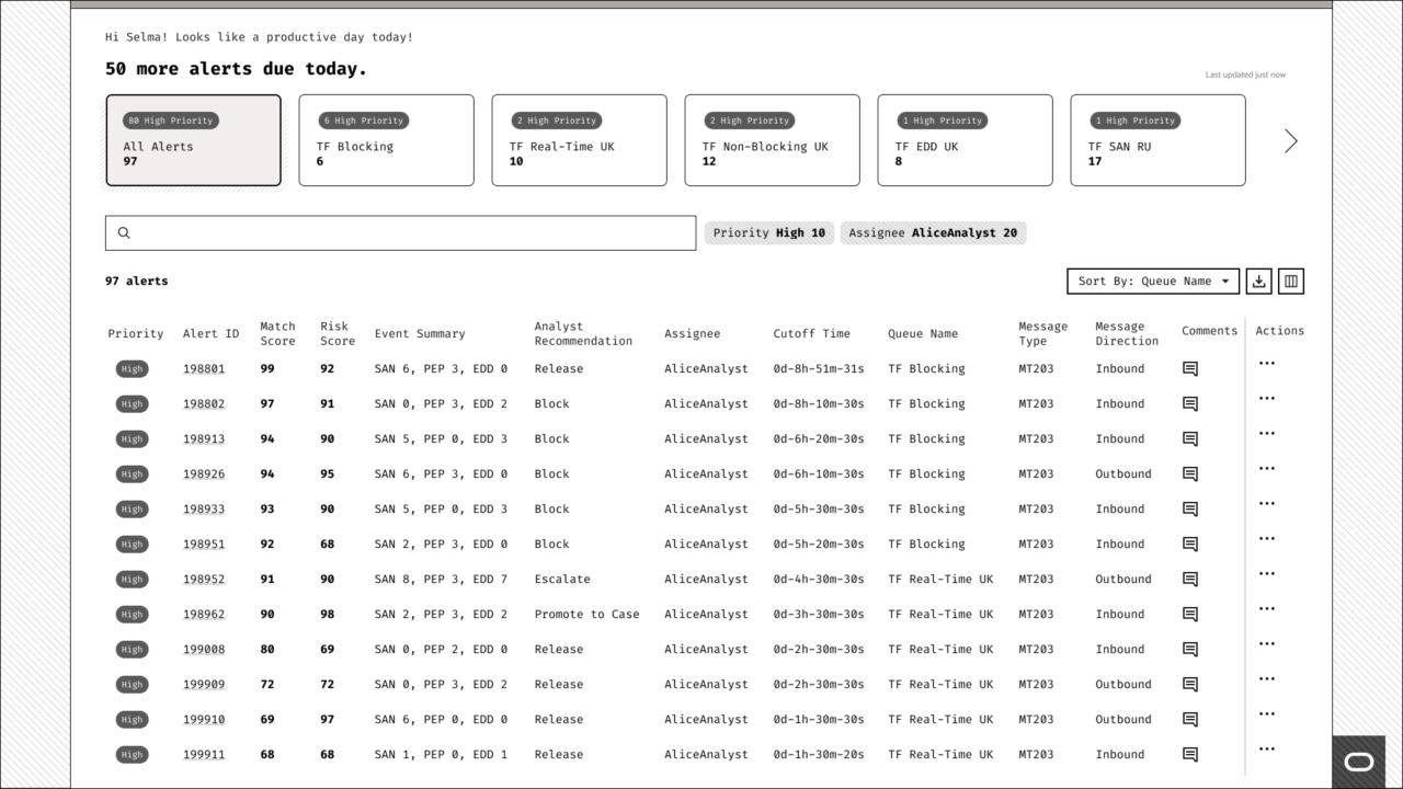
Two attempts. Two dead ends. The right structure was still out there.
6. The Key Decision
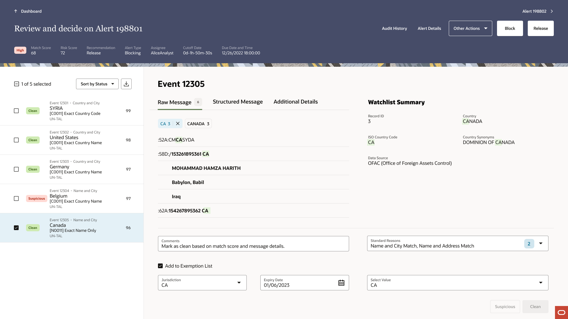
The constraint was clear: Alice needed to see case-level context and event-level detail at the same time, without navigating away from either. Not a drawer. Not a dashboard. Something that kept everything in view: the events, the watchlist, and the decision. All in one place.
I had been working with Brett, the Redwood design system designer building out the Collection Details page template. He had a working version with placeholder data and single selection only. When I put TF’s real use case against it: events list on the left, watchlist comparison on the right — the match was immediate. This was the structure Alice’s workflow actually needed. Every piece of information she required to make a decision, visible in one view. No context switching. No navigation cost.
Mehul had been embedded in the Financial Industries team, absorbing the domain, and we had been brainstorming the problem together throughout. When I brought Collection Details to the table, he saw it too. We aligned quickly, and then we had to defend it.
Design reviews with UX leadership. Stakeholder meetings with VPs and directors. We walked them through what we’d tried, why it hadn’t worked, and why Collection Details solved what the other templates couldn’t. It wasn’t a comfortable position, proposing something different from what leadership had suggested. But we had done the work. We had the evidence. And we stood behind it together.
The decision held.
7. Outcome
The redesign gave Alice a single, structured workspace. Events on the left, watchlist comparison on the right, everything she needed to make a decision without ever leaving the page.
She works through her queue one event at a time, comparing match details against the watchlist directly in view.
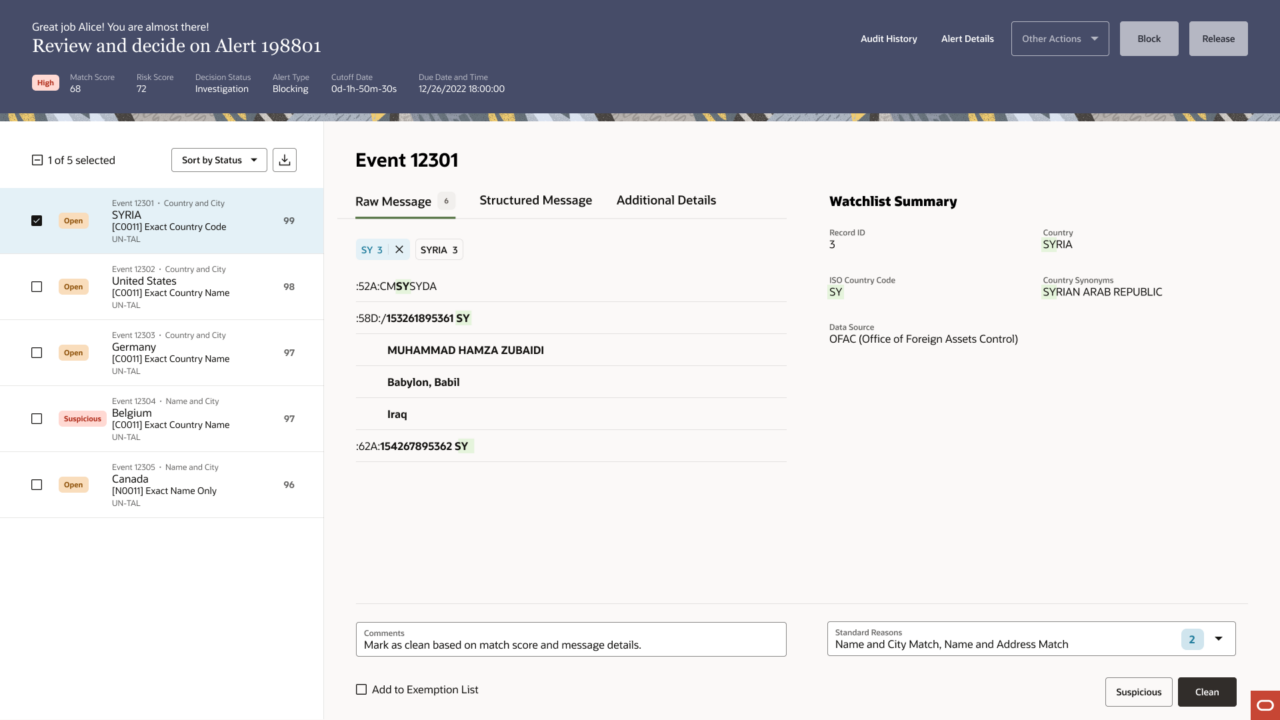
When multiple events share the same pattern, she selects them together and acts in bulk. This was a behavior I proposed to Brett, the Redwood design system designer who was building out the Collection Details template. At the time, the template only supported single selection. TF’s real-world use case required more, analysts needed to act on multiple events at once without losing watchlist context. I proposed that selected events stack as cards on the right, each representing one event’s comparison against the same watchlist record. Brett built it out, and that stacking behavior later carried forward into the Comparison page template. TF became the first real-world proof of what Collection Details could do.
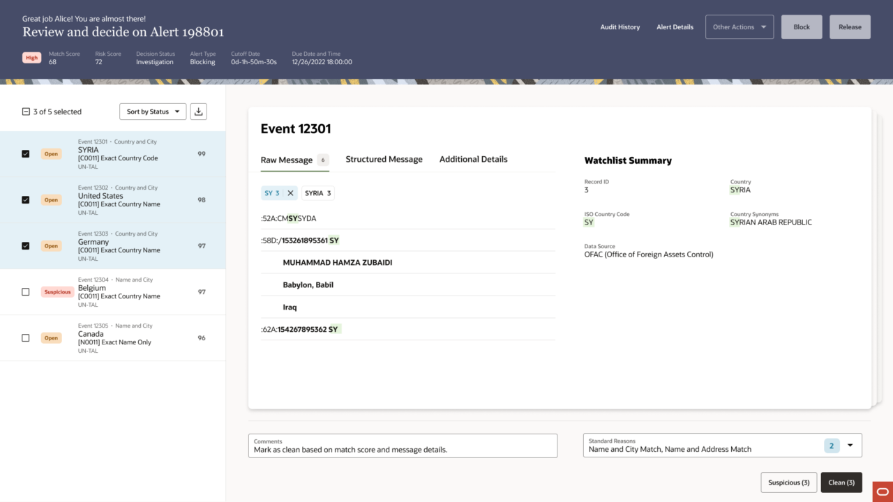
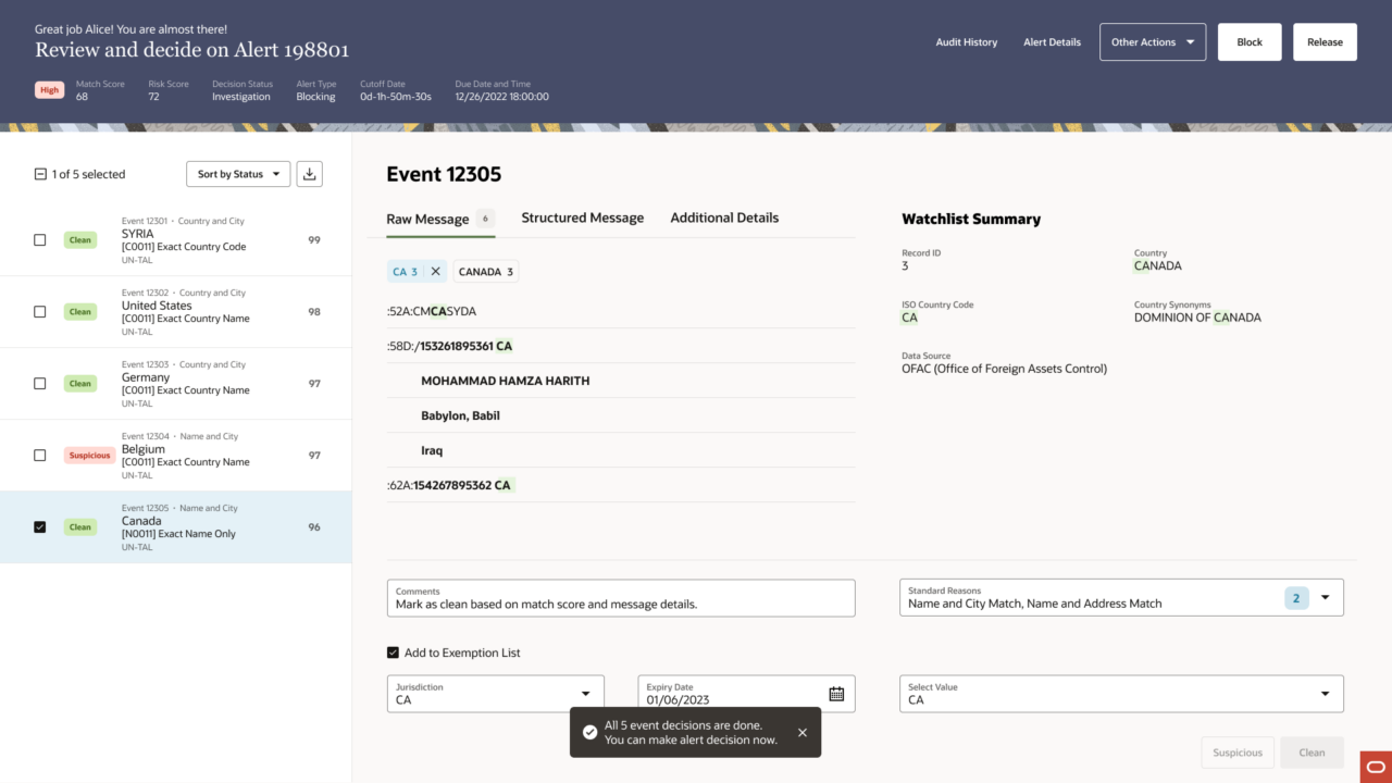
By the last event in the case, the left rail tells the whole story: a visible record of every decision Alice has made, statuses updated in place. When she reaches the final event and flags it for the exemption list, the additional fields expand inline. No modal. No new page.
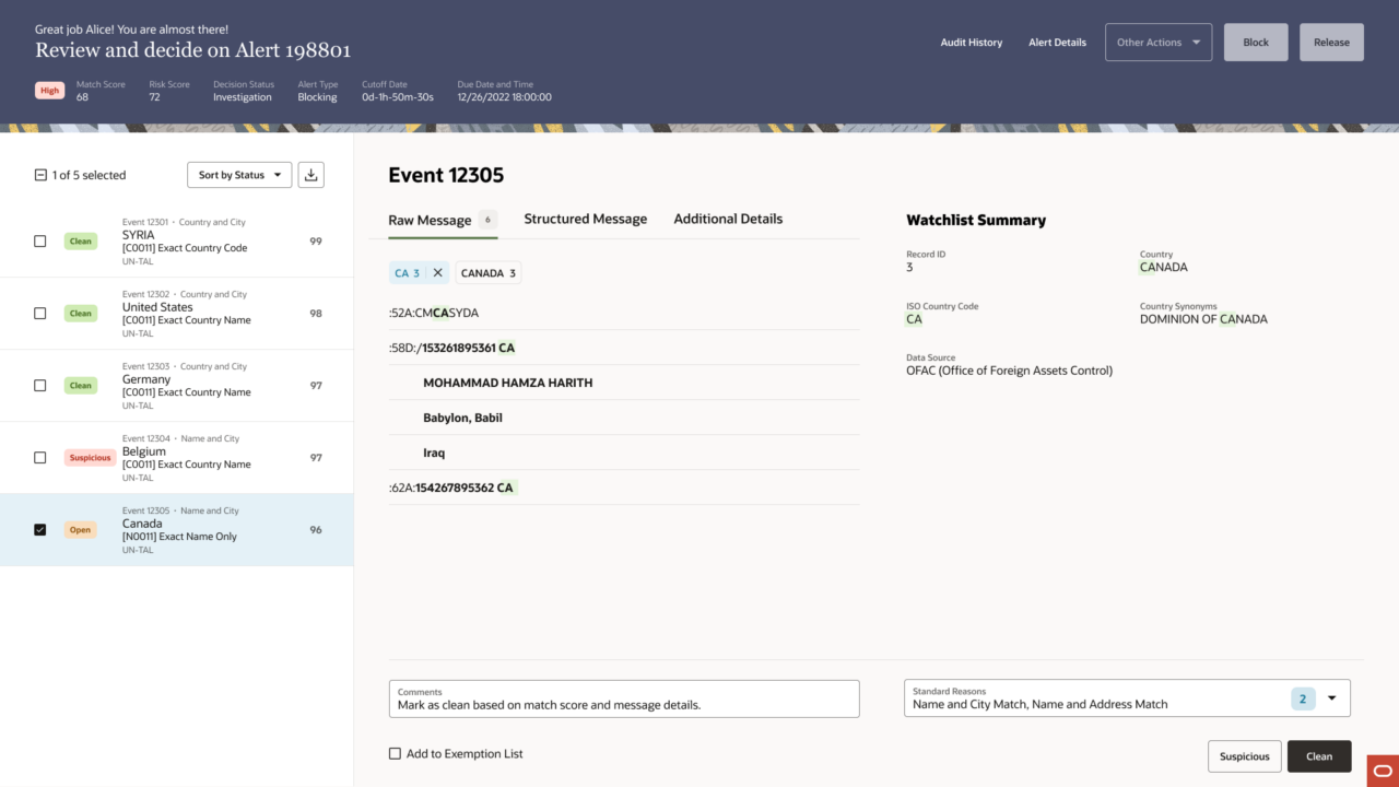
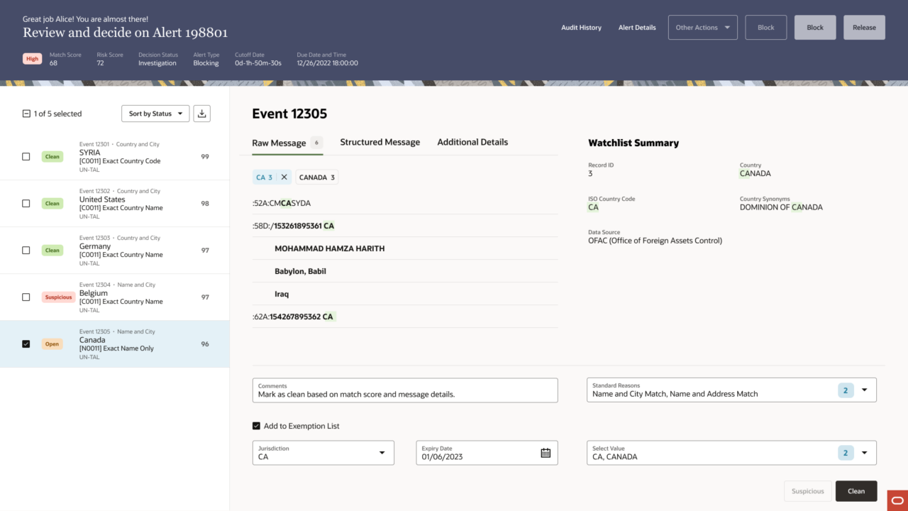
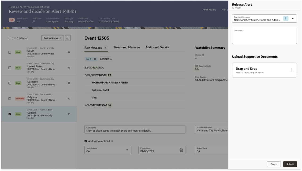
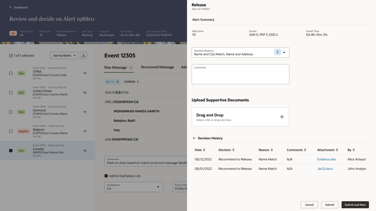
When all five events are resolved, the system confirms it, a toast notification that also unlocks the case-level decision. Alice releases the alert and moves to the next one.
On Selma’s side, the experience is built around her actual job: managing her team’s work, not just reviewing individual alerts. She lands on her full queue, filters to her direct reports, and sees exactly what Alice and Ann have recommended, without having to open each alert to find out.
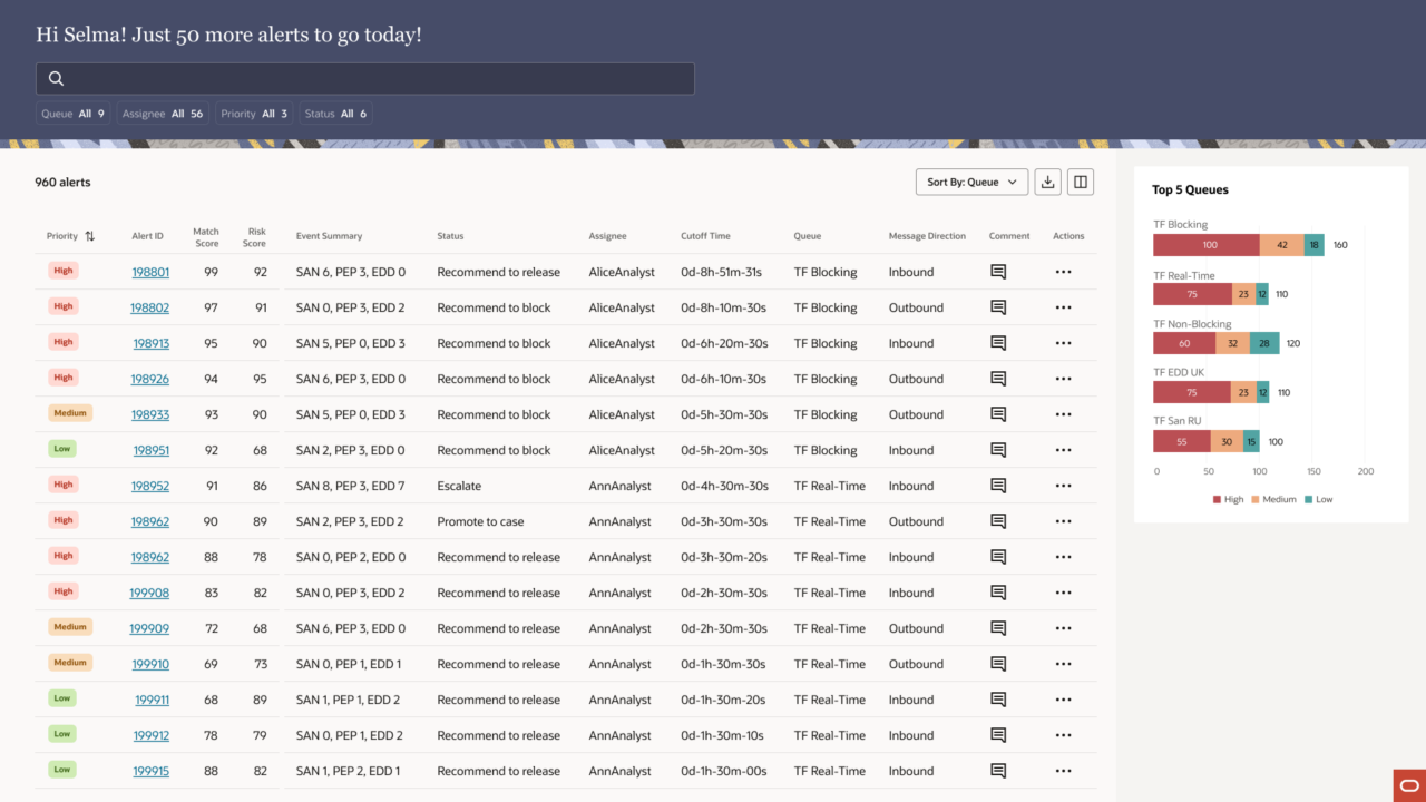
When she opens the alert Alice worked, she sees the same case: the same events, the same watchlist comparison, Alice’s recommendation already surfaced in the header. She reviews, agrees, and releases. The 4-eye flow closes.
Two users. One continuous flow. Every decision traceable, every action in context.
8. Reflection
I had worked on an earlier version of this product. Before this project, Transaction Filtering was one of my first engagements at Oracle, designed in ALTA, Oracle’s previous design system, before Redwood existed. Those screens shipped. They were used. And when Oracle began moving products from ALTA to Redwood, I found myself looking at something I had built and knowing it needed to be rebuilt from the ground up.
That’s an unusual position to be in. Most designers inherit someone else’s decisions. I inherited my own. What I learned is that good design isn’t precious, it’s honest. The earlier version answered the requirements it was given. This version asked better questions.
By the time we were deep in wireframes, people on the team were telling me I had become Alice, living in her queue, thinking in her constraints. I take that as the highest compliment. Good designers are a little like actors: you don’t observe your users from a distance. You inhabit their world long enough to feel what they feel. That’s where the real design decisions come from.
If I could do it again, I’d invest more in research upfront, enough to build the evidence before the exploration. More data earlier means faster, more confident decisions. I’d also carve out more time for usability testing at the end. The studies happened and the results were positive, but I was already deep in the next project. That’s the nature of design consulting, and it’s taught me to be intentional about the time I do have.
What I’m most proud of isn’t the final screens. It’s what it took to get there, trusting instinct when two attempts had already failed, building the case with the evidence we had, and standing behind it with someone I had helped bring onto the team. That kind of conviction is different from designing alone.
Working with Mehul was one of the best parts of this project. I helped bring him in, showed him my process, and watched him find his footing: daily syncs, split tasks, whiteboard sessions, and design reviews. By the end, he wasn’t following my lead anymore. He was a genuine thought partner. Leadership noticed. They paired us again on iHub Audit. We’re still close. We talk about design and life outside of work, the way you do with people who’ve built something real together.
This project gave the Collection Details template its first real-world proof of concept. It gave Mehul a foundation. And it gave me something rarer, the chance to look at my own earlier work and make it better.,